For our first Communication Design Fundamentals (CDF) assignment, we were asked to find an example of what we consider “good” and “bad” communication design. While walking around campus, I began to notice the posters hung on bulletin boards in public spaces such as the University Center, Margaret Morrison, and West Wing Hall. Aside from a few examples, however, I did not find any single poster to display significantly good or bad design.
When I checked my sorority’s mailbox, however, I found a stack of posters in the box that displayed these qualities, were nicely printed in color, and were without the many thumbtack holes, rips, and tears that I saw on the bulletin boards’ posters. Also, something that I found interesting is that both of these documents come from Carnegie Mellon’s Housing and Dining Office, and have been produced by the school’s food service provider, Culinart.
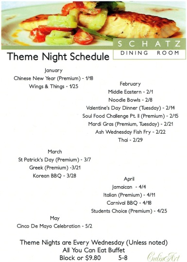
This first image shows what I consider to be an example of “bad” communication design:
I considered this poster to be an example of bad communication design because although the header looks processional and appealing, the body or “meat” of the document has no real visual hierarchy. There is no distinction between important information (such as the month in which this event takes place) and the other information (each event that takes place in that month). Also, it seems as if the creator did not put very much thought into the organization of each block of information. The information has been put into a staggered set of blocks that jump from one side of the page to the other.
This next image demonstrates what I believe to be better communication design:
I believe this poster has better communication design because it demonstrates a better relationship between text and visual elements to create a more interesting poster. There is more visual hierarchy, as the more important information is either colored, bolded, or larger in size. There are other visual elements besides the picture of food, such as the shape that catches the reader’s attention and lets he or she know “not to forget” the important message.

