Category Archives: Uncategorized

Final Assignment: Speech Book!

For my speech book, I chose to use a speech is by U.S. Secretary of Education Arne Duncan called “The Well-Rounded Curriculum.” Found here: http://www2.ed.gov/news/speeches/2010/04/04092010.html. I chose to use this speech because I am very interested in arts education and how different people (and well-regarded ones like Arne Duncan) approach the topic and convey the important ideas to the general public. This speech is also of a good length that I could create a speech book that is at least 8 pages long.

For my speech book, I chose to use more of a magazine-design style to visually represent the content in the speech. I chose this style because it is very editorial looking and professional, and reflects the professional nature of the speech. Because the book was pretty speech heavy, I chose to break up the large blocks of text with images that supplemented the messages in the speech and pull-quotes that highlight important ideas or interesting quotes.

After the first mini crit, one of the things that I needed to go back and fix a lot of was the margin sizes and consistency among these margins. These smaller details were sometimes easy to gloss over, so I had to be sure to be careful about making even the smallest details consistent throughout the book.

One thing that I ended up spending a good amount of time on was making make sure the text was aligned with all of the other text and that there weren’t any widows or isolated lines of text. This was particularly difficult when making edits with sizing photos or quotes, because any slight change would change the position of the text in all following pages. After seeing my classmates’ final speech books, something that I would want to improve on my book in the future is the large amount of text. I wanted to preserve the original text and avoid cutting out various sections, so it ended up being a little wordier than I realize I would have liked.

I thought that this assignment was a great culminating project that combined our acquired skills in InDesign and Illustrator, the interaction between text and visuals, and knowledge of typographic hierarchy.

Initial Sketch: 

First draft (presented at mini-crit): Booklet

Final: Booklet (1)

A4 Process

Sketches to come!

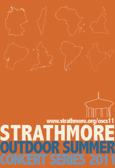
For assignment 4, I created a poster, website, and infographic that advertised Strathmore’s 2011 Outdoor Summer Concert Series. After a quick initial revision, I decided that the hook for my series would be the international aspect of the concerts’ artists. For the poster especially, I didn’t really know how to get the point across that the focus and hook of the series was the international aspect. After talking and brainstorming with Kinnari and Priscilla, however, I decided to create outline vector images of each of the countries or regions that will be represented in the concert.

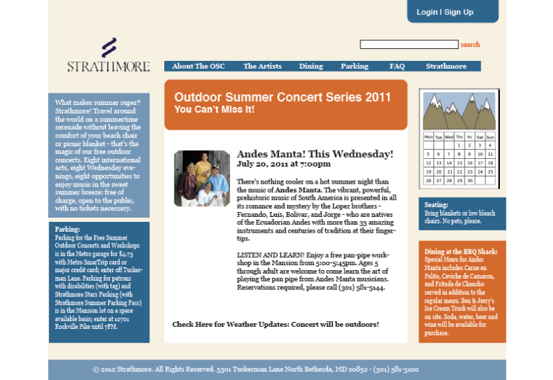
On this poster, there is a link that will take the viewer to the concert series’ own website. On this website, the user can find a description of the series, information about the dates of the concerts, biographies of the artists, a calendar of events, and live updates on cancellations or inclement weather. When creating this website, I tried to think about what information would be essential to the understanding of a user when considering attending the concerts. I then tried to organize these elements in a logical way, taking cues from websites that I already find to be effective. On the website, the user is given the option of viewing an interactive and visual representation of the concert series’ global nature. By clicking on this link, the user will be directed to this infographic.

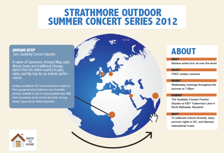
The infographic that I chose to create for this project is a globe that is able to be panned across. This element of the website is represented in my design as a hand, which could be used to drag across the globe and turn it. The globe on the infographic would have orange dots representing a musical artist or band. If the user is interested in who is playing from Cameroon, for example, he or she need only click this dot to produce a pop-out display that gives information on who the artist is and the details for that performance. I myself am a visual person, so I thought that having this visual element to the concert series would prove useful for understanding just how global the reach of this concert series is. On the infographic, the user would be able to navigate back to the website’s homepage to get more information as necessary.

Assignment 4

Image

Poster for the Outdoor Summer Concert Series. The bold colors are meant to reflect the colors of warm summer nights. The hook that I tried to play off of in this poster is the international aspect of the concert series. Therefore, each of the white outlines represents a country or continent that will be featured through an artist or band at the concerts. These images should catch the viewer’s interest and make them interested in what types of music or artists would come from these countries, inviting them to visit the website.

Image

Website for the Outdoor Summer Concert Series. This website should provide the interested viewer with more information on what the concert series is about, who the upcoming artists are, and where the venue at Strathmore is. The center section would include a feature article about one of the upcoming artists as well as a news ticker letting the patrons know if the concert might need to be moved indoors due to weather.

Image

Infographic for the Outdoor Summer Concert Series. This infographic provides a visual representation of what areas the concert series features. The user would be able to pan the globe and view what locations would feature artists (represented by the orange dots). By clicking on one of the dots, the user would be able to see which arts would be coming from this country, and on what date and time. On the side panel, there would be basic information about the who, what, when, where, and why of the concert series.

A4 Proposal

For A4, I would like to create a series of interactive elements that advertise Strathmore–a performing arts center in Bethesda, Maryland–and its annual outdoor summer concert series. I interned for this organization last summer, and would like to help them create a design campaign that helps them to better advertise the events and communicate their message. The themes that will be explored in this series are arts/music education and how important these themes are for people of all ages–children, teenagers, adults, and seniors.

I plan on using certain typographic illustration and geometric shapes that are unique to Strathmore, such as it’s architecture and outdoor facade. Because these events and their outdoor qualities are unique to Strathmore, I feel that these will be the most important elements in my design. This is a series of outdoor concerts, so each event will need to be outlined clearly so that there is no confusion between the similar, yet distinct events. I plan on hooking the viewer by advertising the unique nature of the concert series (which explores a band/musician from many different countries in the world).

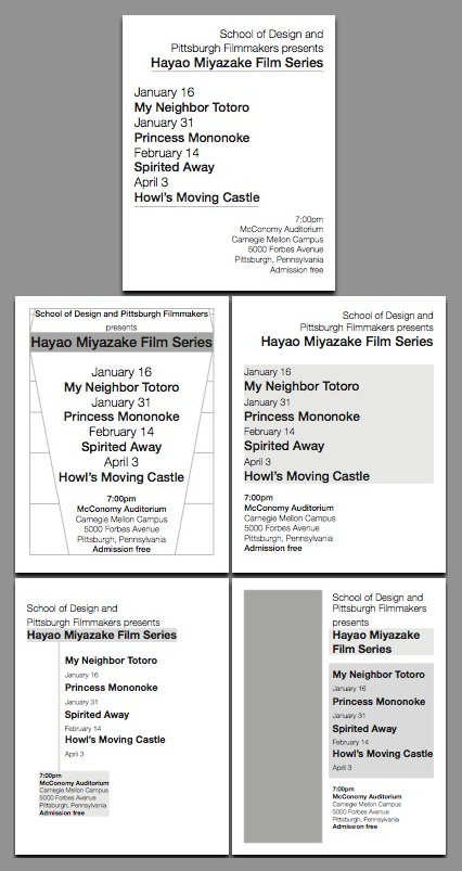
Assignment 3: Typographic Hierarchy Part 2

Final design:

Poster

———————————


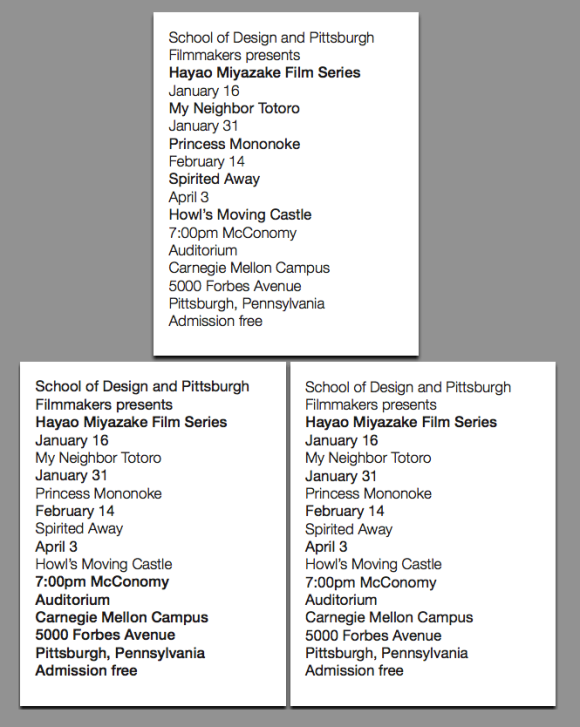
Exercise 8 — Size change and typographic weight

Exercise 9 — Graphic elements: rules, bullets, geometric shapes

Assignment 3: Typographic Hierarchy

Exercise 1 — linespacing

Exercise 2 — typographic weights

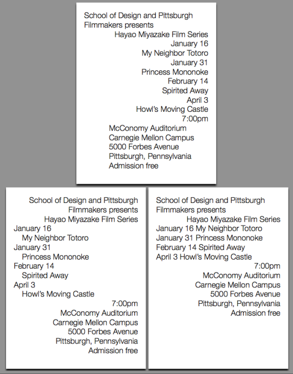
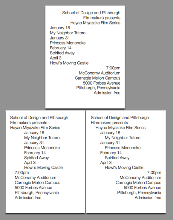
Exercise 3 — horizontal shift: two flush-left margins

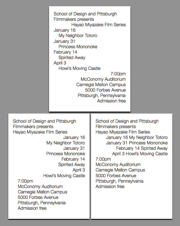
Exercise 4 — horizontal shift: three flush-left margins

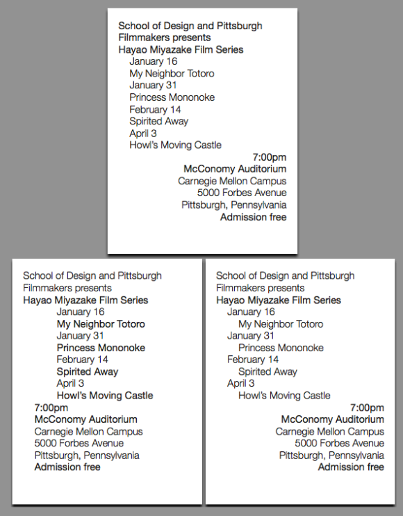
Exercise 5 — linespacing and typographic weight

Exercise 6 — typographic weights and horizontal shift

Exercise 7 — horizontal shift and linespacing

Thinking With Type: Letter

This section in Ellen Lutpon’s “Thinking With Type” provided me with an interesting look into how type and various typefaces have changed from the early use of moveable type to the current advances in digital type. After reading through how type has changed due to changing times and their technologies, I would have to say that the “monster fonts”–or “big, bold faces…designed by distoring the anatomical elements of classical letters” (pg. 21)–were my favorites. These bold fonts are similar to the ones that we often see in advertising and media, which is where my interests lie. For this reason, I think that I am particularly drawn to these styles of type. Looking at the large gothic types especially, the letterforms catch my eye and create an aesthetically pleasing reading experience for me.

If I had to choose any type of lettering that was my absolute favorite in this section, however, it would be the hand lettering on pages 50 and 51. This hand lettering is very close to graphic design and art, and its organic, different shaped letters make it seem very personal and special. Because we probably won’t be dealing with hand lettering in this course, however, I would still choose monster fonts as my favorite because they have this same big and bold feel to them.